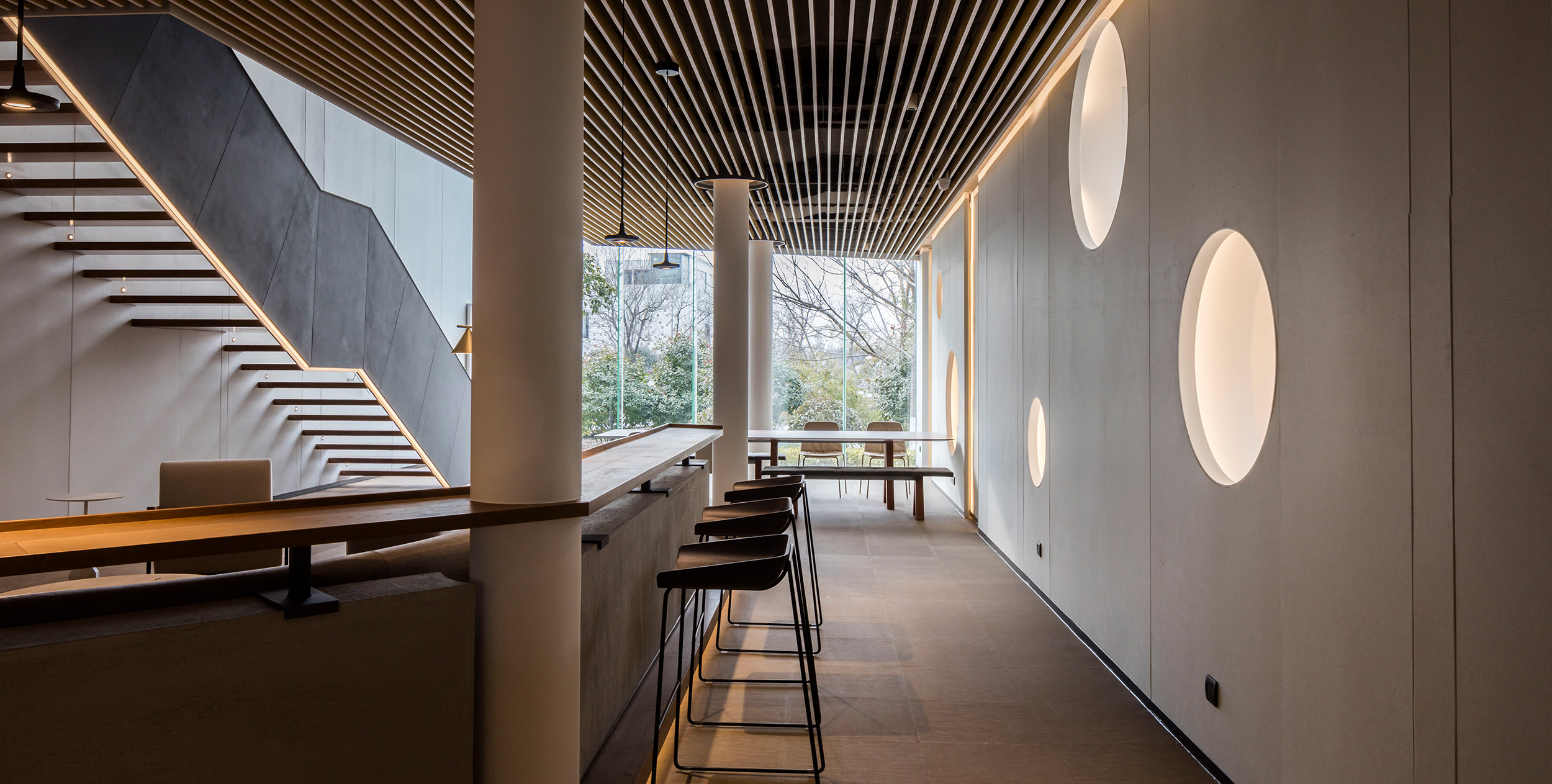
Y20 SPACE is located in the Hongyuan Park inside of the famous Hangzhou XiXi Wetland and surrounded by charming natural scenery and profound historical culture. This area is attracting a large number of small and medium enterprises, such as investment companies, Internet Co, and many start-up companies. When the owner AIcai Technology found us, they did not just want a work place, but more to create a space for office work, business conference, activities, presentations and exhibitions.
After we learnt our customer’s demand, we have carried out the overall design of the space from the point of view of the positioning and functional requirements of the whole building. The original building is more like a sculpture, standing in the XiXi Wetland scenic spot for people to see. Our design challenge is to through our design idea we create an atmosphere like WEWORK, make a difference from the traditional work space in the neighborhood, meanwhile we had to think how to create an attractive experience in this shared business space.
The landscape of the original main entrance of the building is very good, so we changed it into sunken yard. With the surrounding white wall, it becomes a great place for people to spend their leisure time and enjoy the views of the landscape. The transparent glass wall makes the indoor space bright and brings an open vision for the people inside of the building. The white exterior wall, the red seats, the light solid wood, the cement, and the plants bring a concept of the modern simplicity.
We made a whole new entrance to the side of the building and made it like a channel as we wanted to convey a ritual sense of space, create a time tunnel feeling. Walking though the channel we can see an open interior space which brings a strong contrast between the narrow entrance and the open bright interior space.
The whole construction is slightly thick, so we use white as its main tone for the indoor space and used a lot of wood as the main material for interior decoration to create a sense of lightness. The original building itself is like a letter Y, so the streamline of the indoor space is designed to act in coordination with the building. The gray color and the original cement make the space simple and pure.
Due to the limitations of the construction some parts of the interior space are relatively narrow and lack sun light. We changed some walls into glass so we could make a connection between the indoor space and the outdoor environment and bring an open view for the people inside. Also we used a lot natural material to make the interior space a extension of the outdoor environment so people here can feel the seasons change.
We think that design is not a skill, but a sense of perception and insight that captures the nature of things. The main concern is not the form, the space or the image, but the users’ experience. Space is invisible but it is as rich as life and full of dynamic just like breeze, you cant see it but you can always feel it. This is a kind of new work environment experience that we always want to bring to people.
The whole space of the building is very high, so the echo is too loud. We used sound-absorbing walls to make the space less noisy so people can avoid discomfort caused by the echo or resonate during the daily activities. We also preserved some space in the window area that is convenient and flexible for the future demand.
The holes in the original building wall are well preserved. They are the windows to the beautiful views, just like eyes are the window of the soul.
The sunken chatting area makes the visual level closer to the nature when you look at the outside landscape. And the fireplace brings warmth to the space.
We see a quiet and warm atmosphere in Y 20 Space like a natural gift to let people inside explore and seek.


