ANSHUKA was founded in 2010 on Nanshan Road, Hangzhou, next to the famous West Lake. It is named after the owner’s name “An”, meaning “kindness “. It is the first Western-style pastry store to bring semi-cooked cheese products into China, leading the domestic market, and it has been recognized by customers for nearly ten years.
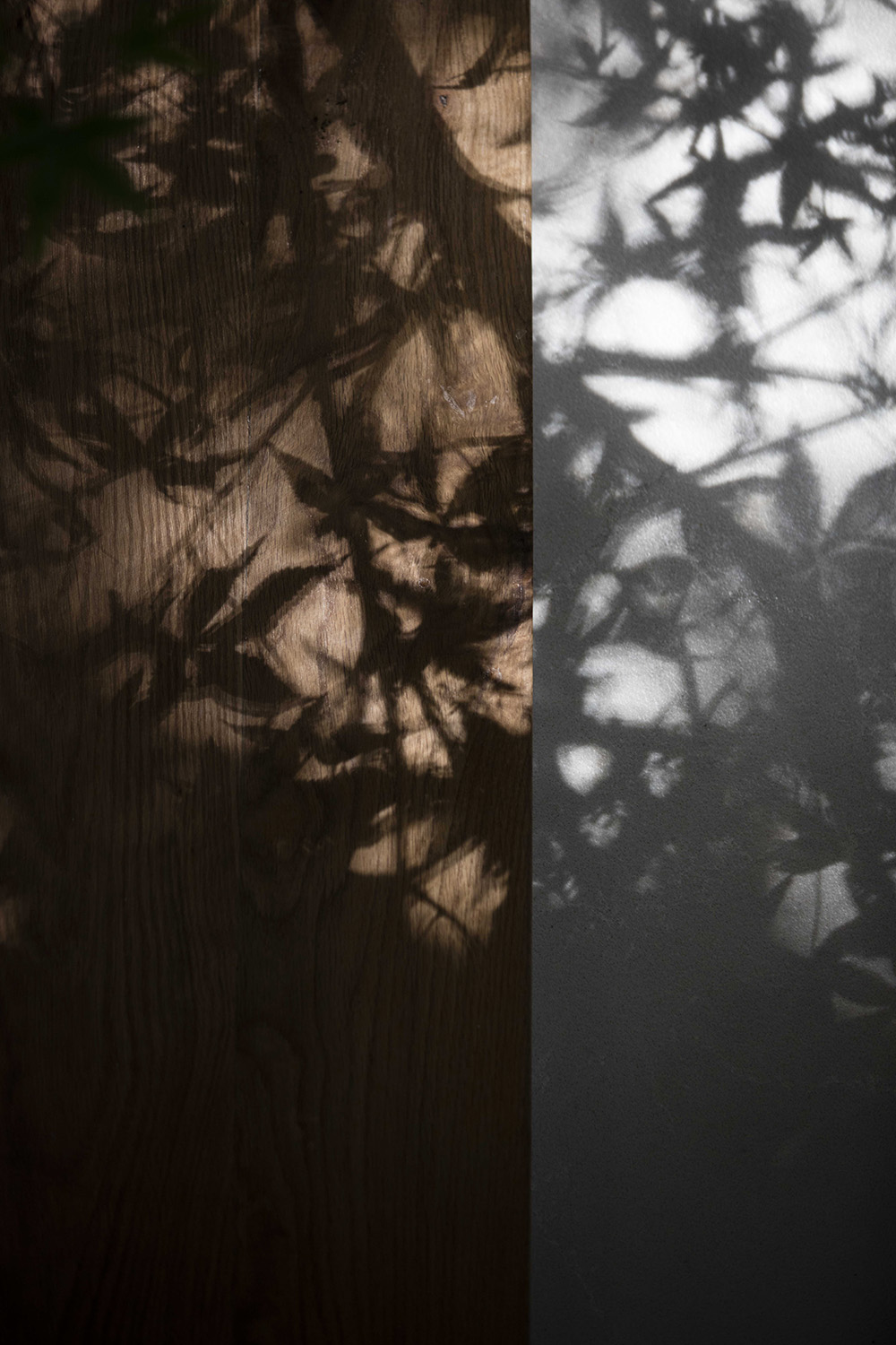
When the designer Hu Zhile talked about the inspiration of ANSHUKA, he said,when I walk on Nanshan Road, the leaves of the phoenix trees on both sides are dancing in the air. And walking in the shadow makes people feel very good and quiet. At that time, I was thinking about how to present the building in such an environment.
Nanshan Road is familiar to people in Hangzhou, and the memory of the phoenix tree is always with peace. We see people passing by quickly. The fast pace of modern urban life makes it easy for people to ignore small tiny nice things around them. And I hope that ANSHUKA can make a space where people are willing to slow down and stay, to feel the life for a while, even if it is just a cup of afternoon tea or a dessert time.
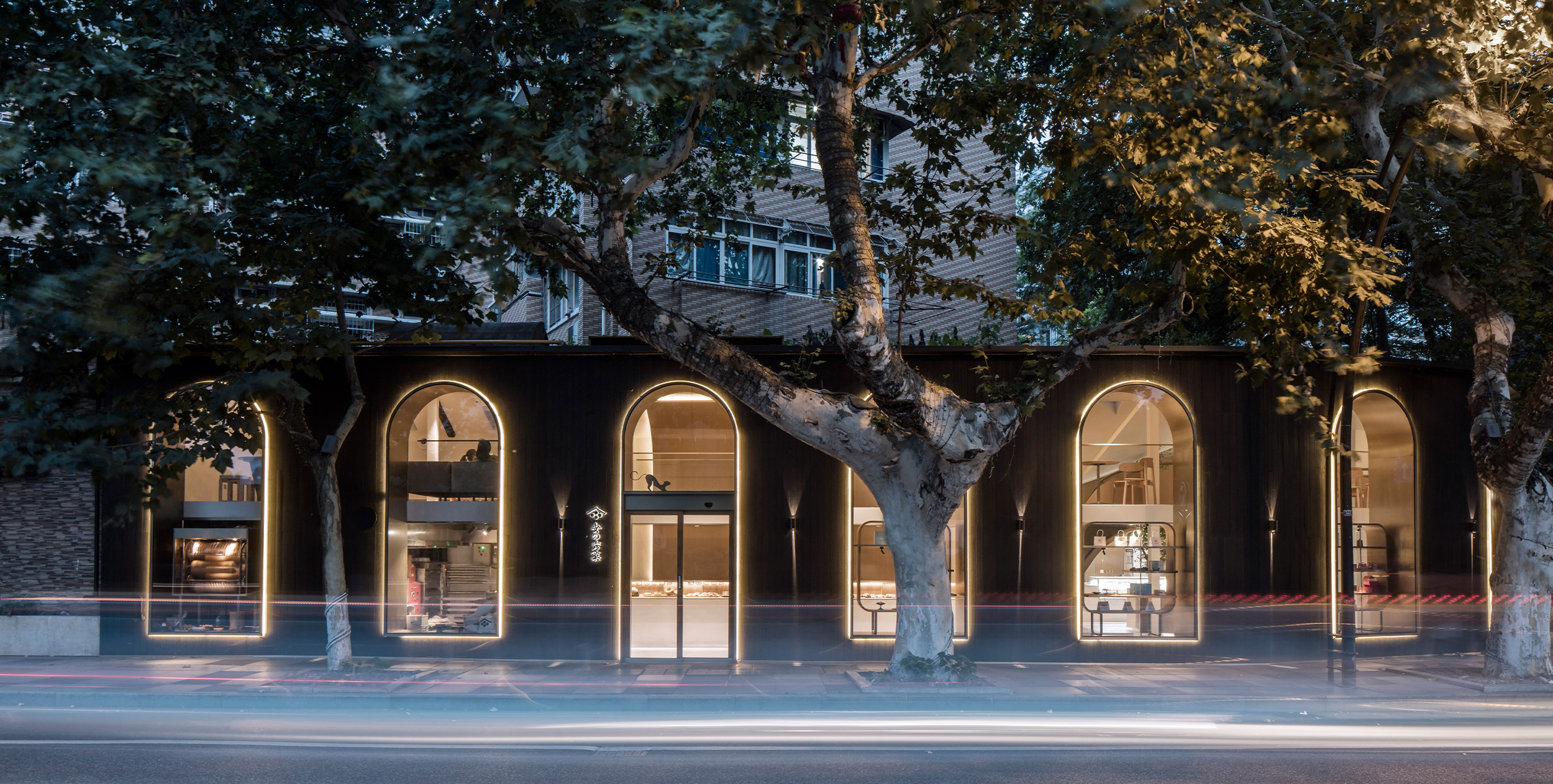
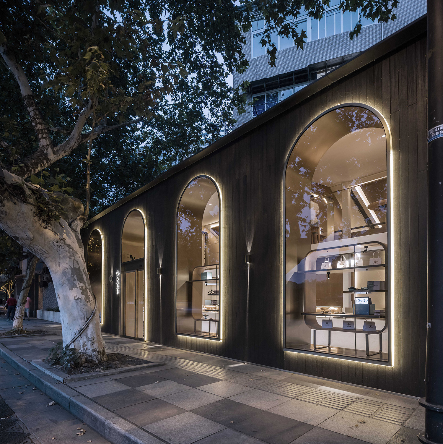
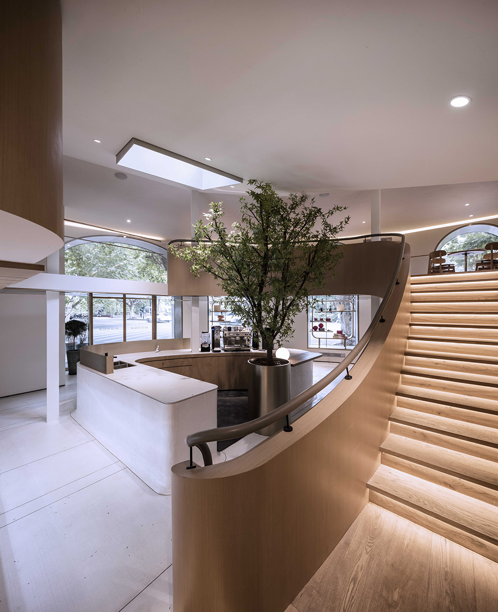
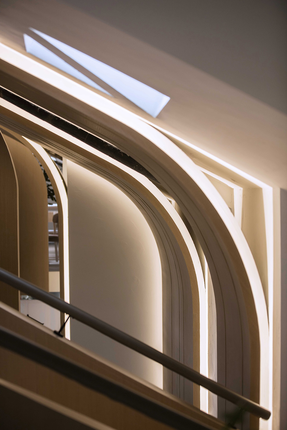
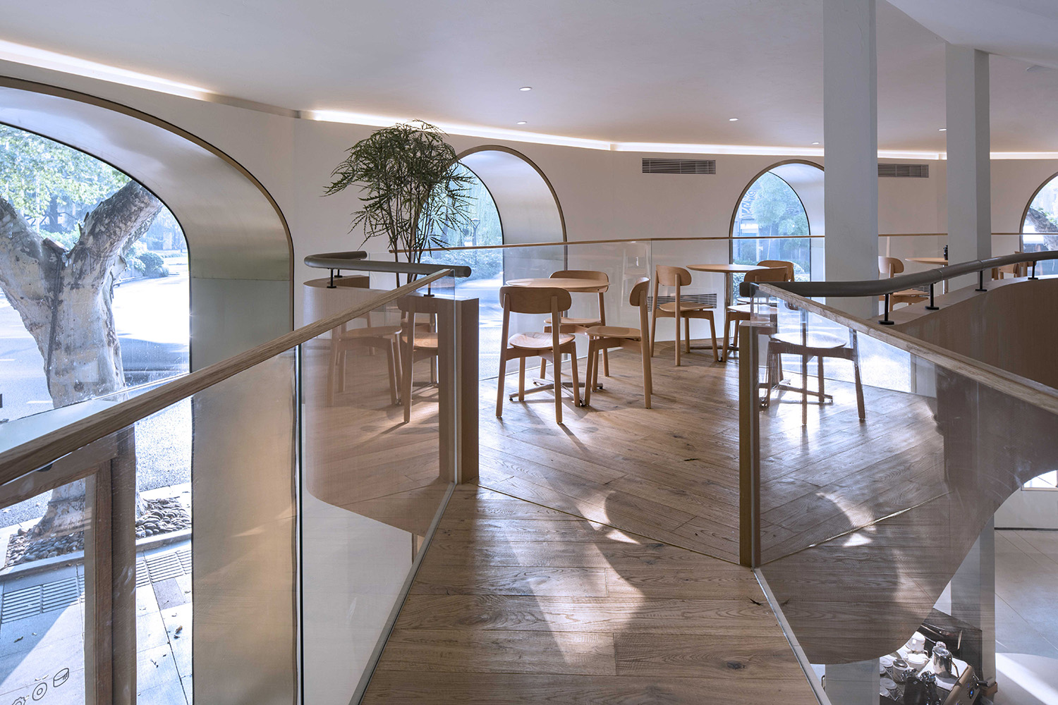
In the overall renovation of ANSHUKA, the designer transformed the original milky yellow simple wall into a dark facade, supplemented by a golden frame, so that the whole building can echo to the surrounding environment and blend perfectly. We use white and wood as the main tone to create a more natural bright feeling. In order to attract more attention and people, we make the best use of the large arch-shaped floor windows to solve this problem appropriately. Whether at dusk or at night, the indoor activities reflect through the window has become a beautiful scenery on the street.
The arched glass that extends from the first floor to the second floor reflects the lush phoenix trees along the roadside. The entire building’s facade becomes alive covered with different coats as natural as it.
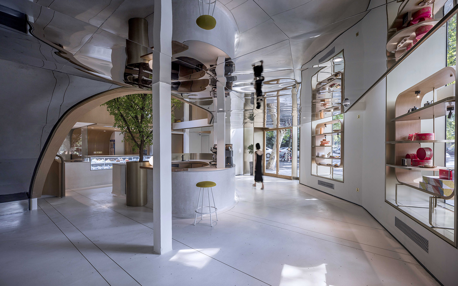
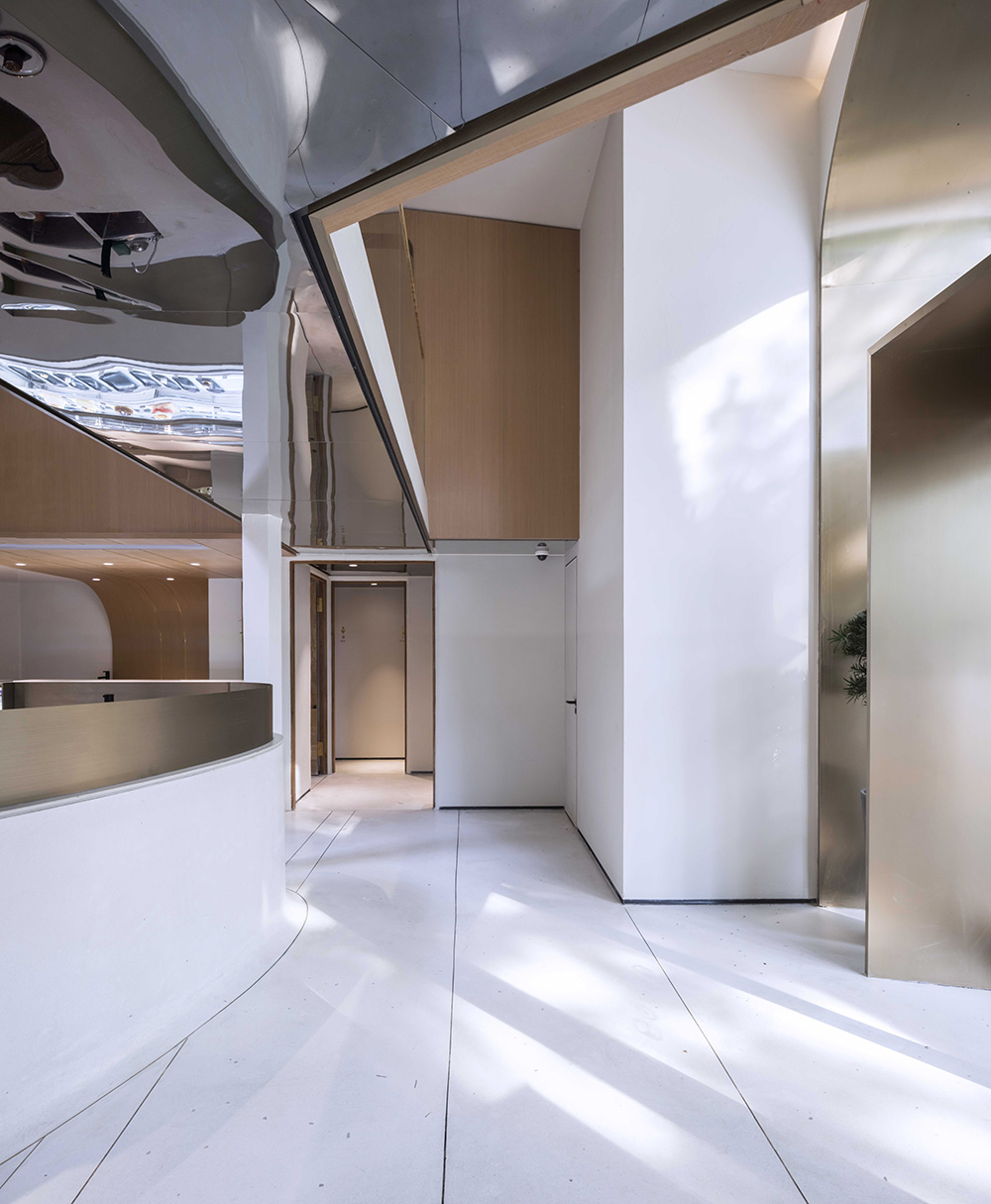
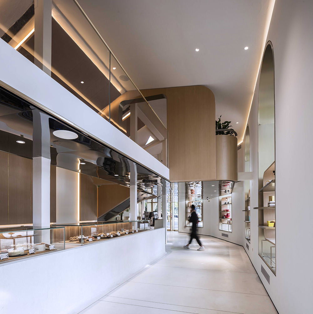
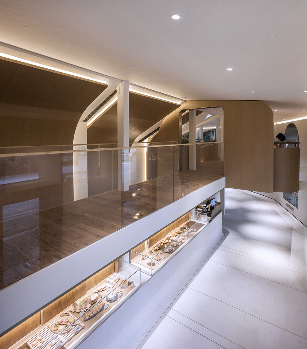
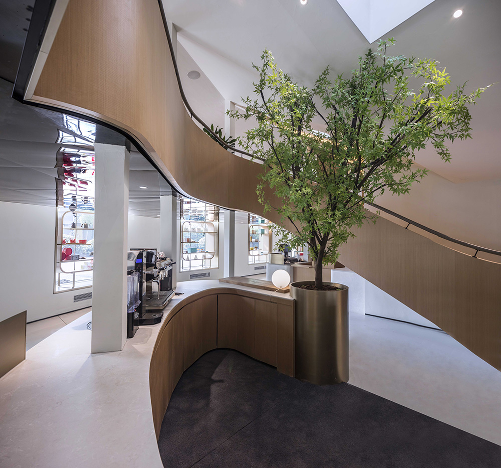
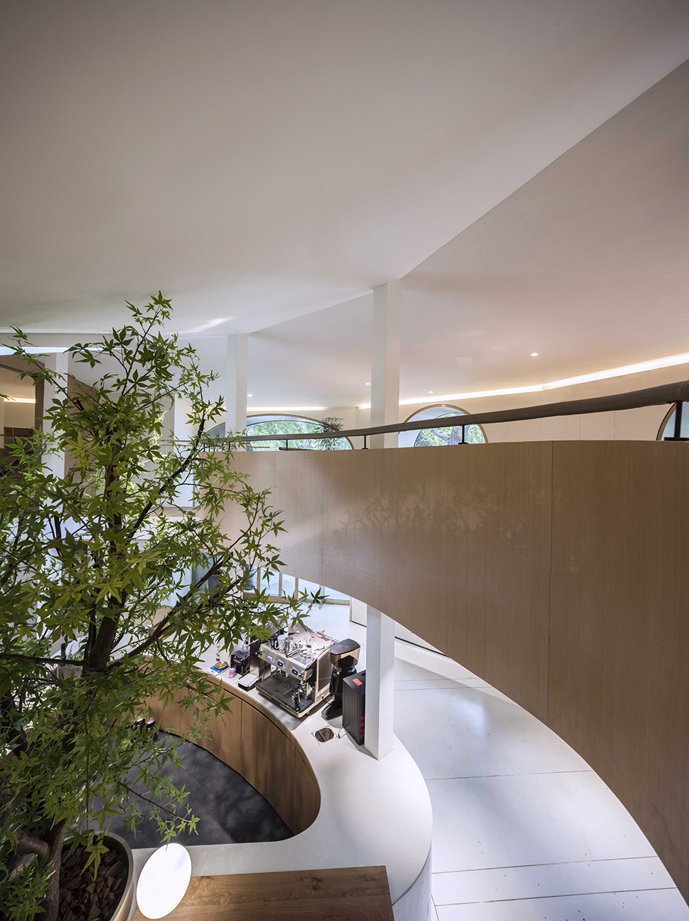
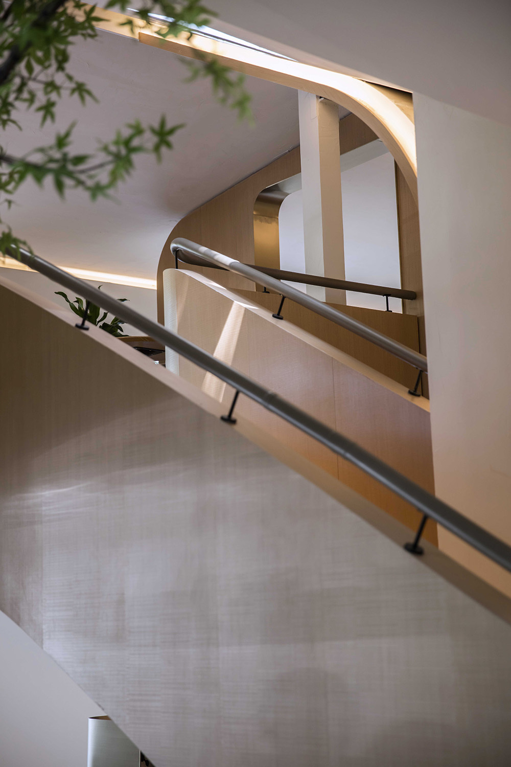
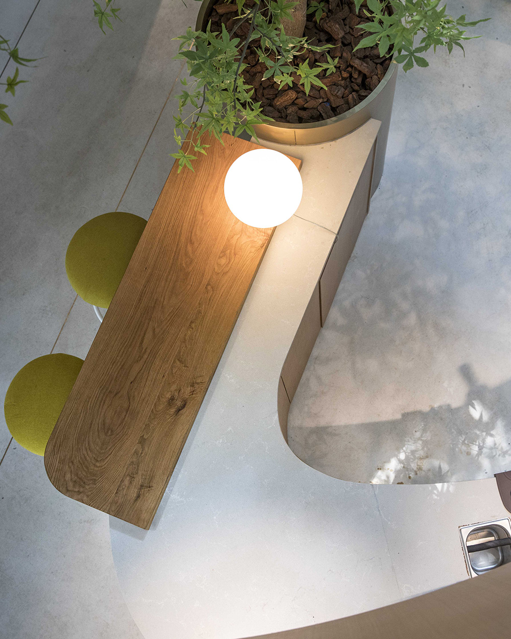
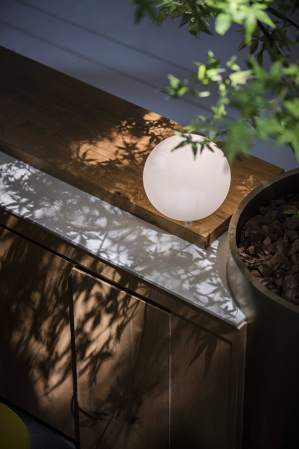
Throughout the design process, we used simple materials to echo the pursuit of ANSHUKA in the ingredients. Therefore, we used wood and metal materials in the interior space. The ultimate goal of doing subtraction in interior space is to highlight the product’s presentation. When we see the product on the shelf, the delicacy of the dessert is as well presented as expected.
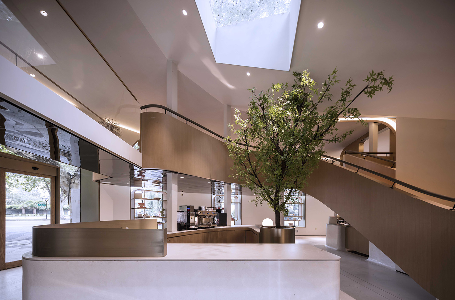
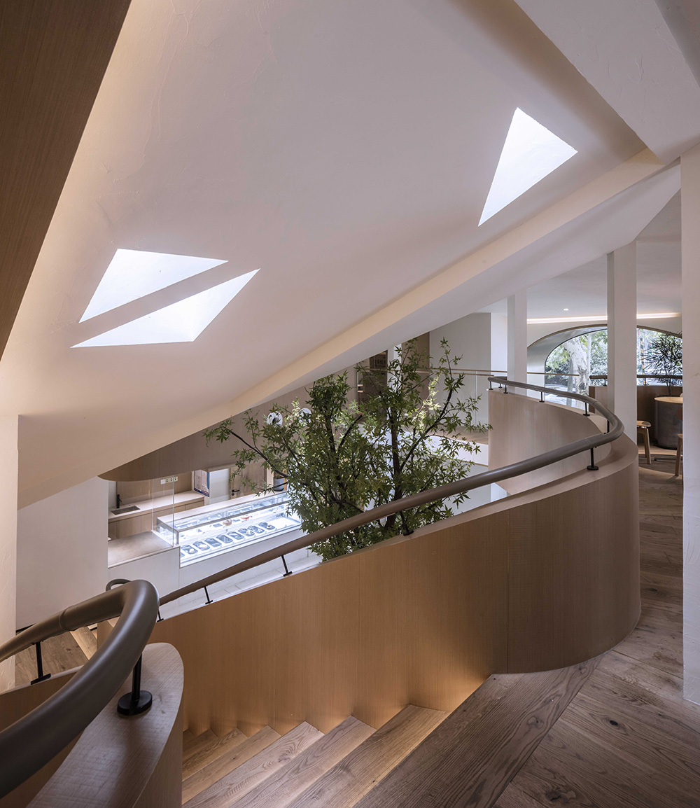
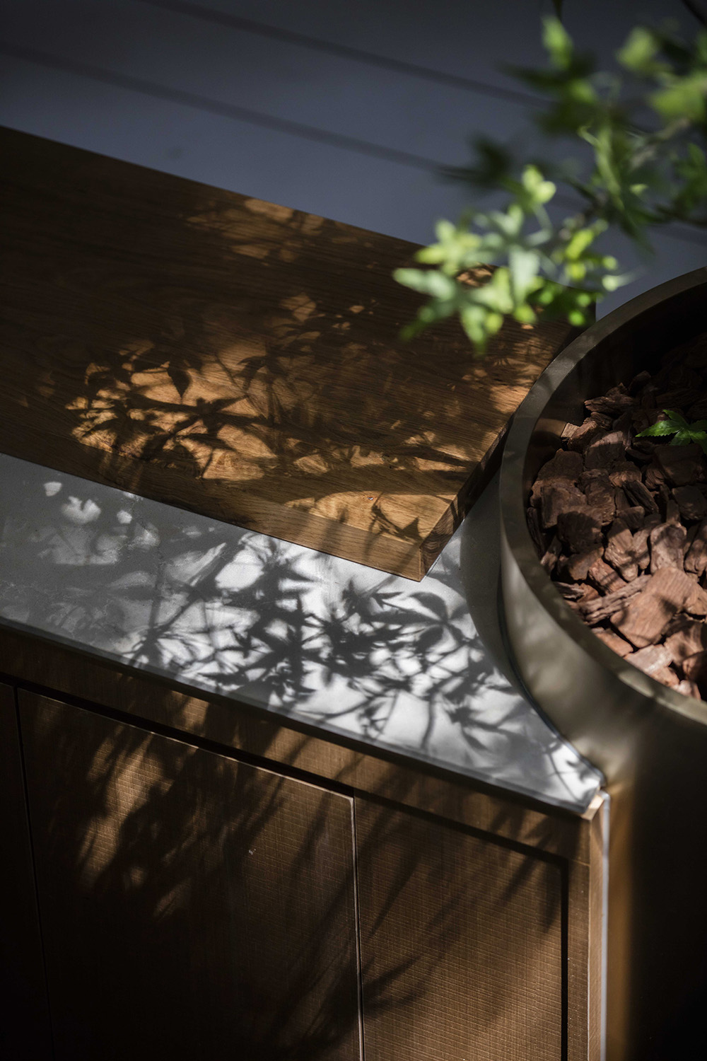
We use glass and skylights to conduct sunlight into the room. When it’s sunny, when you’re enjoying dessert in the store, you’ll be surprised to discover that the flowing lights and shadows have become the souls of the whole space. They come from passing pedestrians, street trees, bicycles, passing cars. These interlaced images often bring inadvertent excitement at different times.
When you walk in as a customer and sit down to enjoy the dessert. You may find that all the designs may be casual. While you sit next to the phoenix trees seeing the light and shadow changes, you may watch people passing by and see the sunlight through the skylight casts on the plants. The gentleness of light and shadow makes you forget the passage of time. You leaned on the sofa quietly, feeling maybe this comfort is just right.


