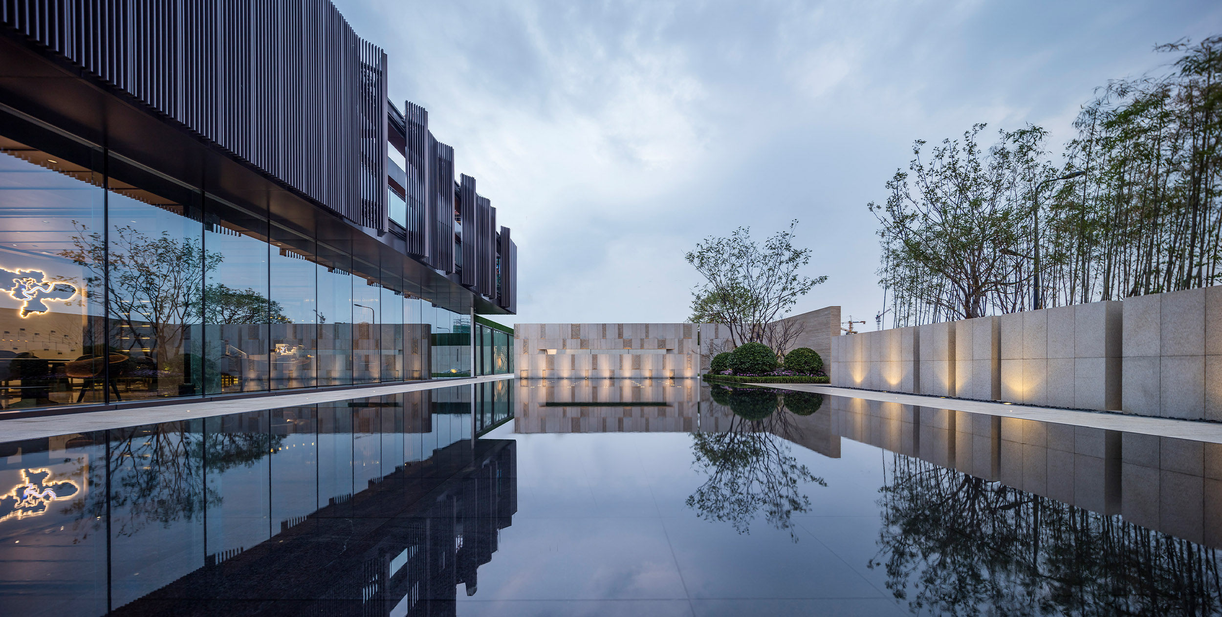
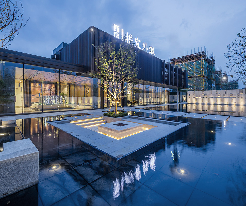
Gongchen Bund Center of Xihu is an integration project of architectural, interior and landscape design. At the beginning of this project, what we were asked to do is the interior design. The original architecture design is a space with a French facade. The idea was lacking of thinking of the connection between the building and the surroundings. A building stand alone can only provide an experience of the interior decoration with no connection with the outside environment. What we wanted is to redefine the project in a holistic way of thinking through a reorganization of the overall space.
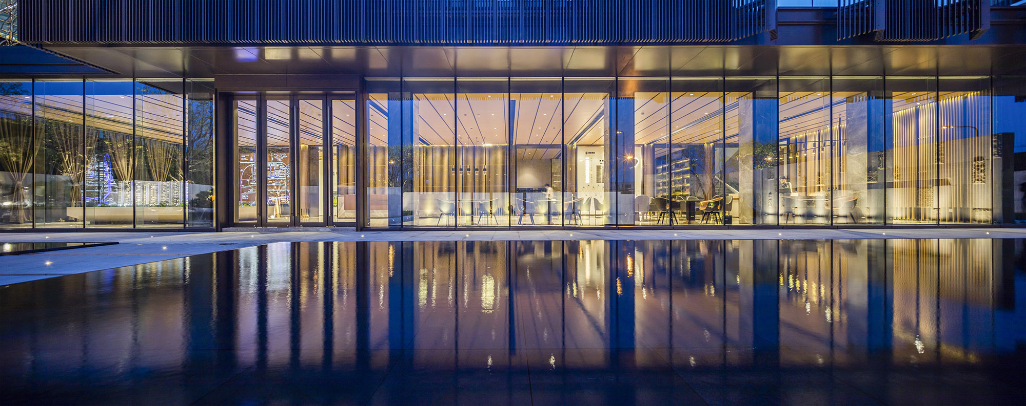
Like most commercial Centers, the basic function of this project is for business, therefore, the decoration needs to be fancy and rich. However, what we wanted is to make this space simple, and pay more attention to the connection between inside and outside space and present the content in a better way through this space. In the night, the inside space reflects on the water makes the outside of the building connected with the inside space.
The landscape of the courtyard perfectly separates the Center from the outside noisy street. A quiet beautiful view well presented right in front of the people once they walk through the entrance. The walls of the entire first floor are glasses and the shape of the building is a simple square. With the reflection in the water, the building looks less heavy. We built a outdoor pool in the courtyard so that people can have a place to stay and enjoy their leisure time and have a touch of the nature.
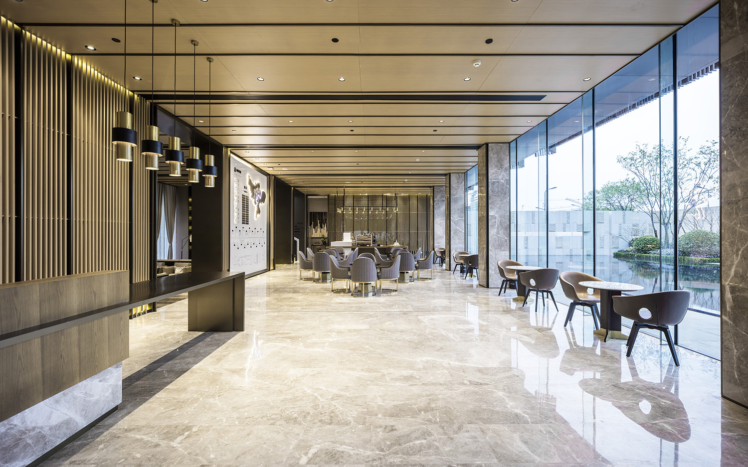
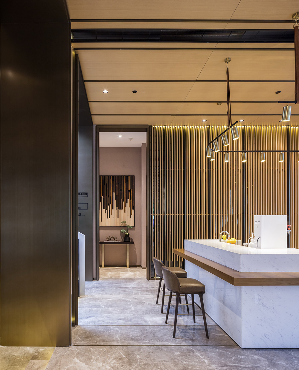
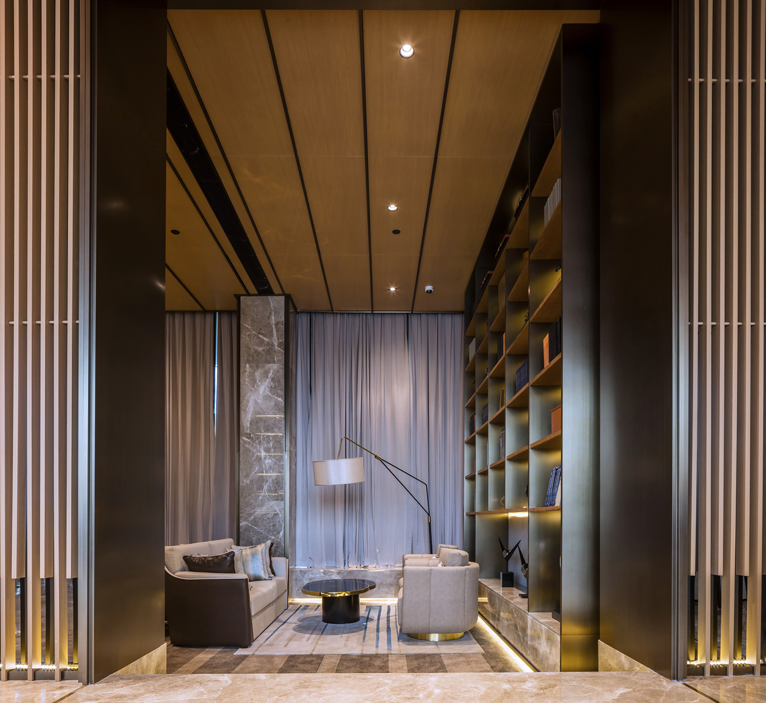
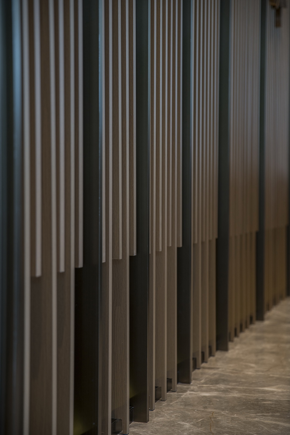
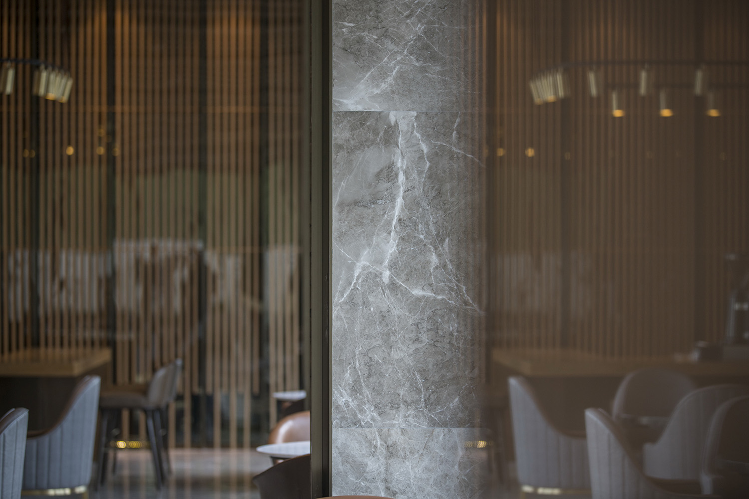
To be consistent with the external style, the elements used to decorate the lobby are also simple. The lattice divider inside is a good extension of the glass facade, and the grey glass inside are used to create an extended view in the limited space.
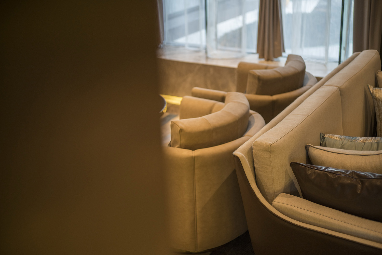
The communication space on the first floor is not separated from the lobby so the functional area is visually connected with the overall space. Meanwhile the indoor leisure space is also visually connected with the outdoor space. The design idea of the first floor is all about views. The indoor and outdoor views are well connected. The bar in the middle of the lobby is not only a function area but also a part of the indoor decoration.
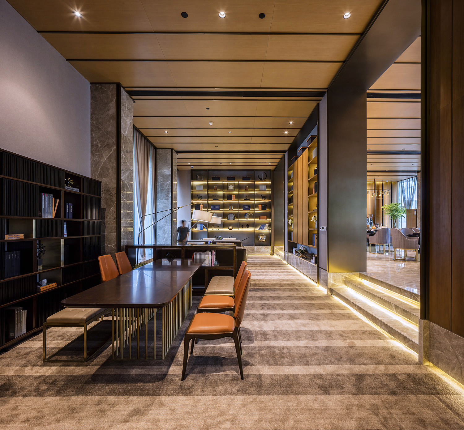
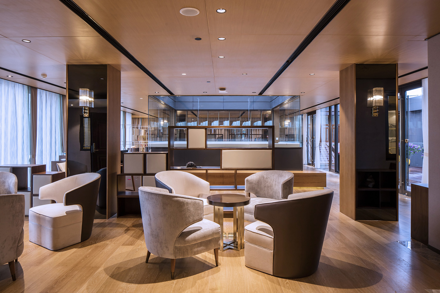
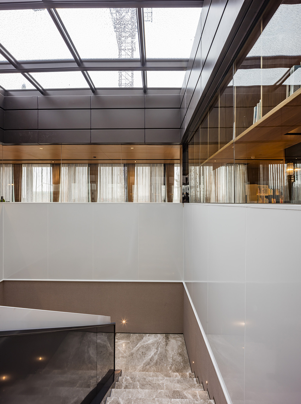
The roof on the top of the staircase to the second floor is glass so the sunlight can cast in throughout the space. Half the space on the second floor is designed as a sample room, and the other half is made a reading area. There is no good natural view in the surrounding area since there are only noisy streets and buildings under constructing, therefore, we wanted to build a roof garden on the top of second floor and create a courtyard landscape by using glass as barriers.
Due to the commercial consideration, the roof garden is turned to be a Children's entertainment space. In fact, we think that changing is also a part of design work. The final use of space will vary depend on the actual user and will not be changed with the designer's will. However, a good space design will bring different people different imagination and the space will present different states in different eyes.
Design is to imagine and create a form of an object. Whether we design the space in a fancy or simple way, we shall not ignore the real feelings we have about the buildings themselves. Buildings are artificial, and we need to experience the original inspiration, so sometimes, a designer also needs to be a discoverer. Nowadays, buildings are designed in a variety of forms and shapes and modern architecture is more aggressive. We forget the genuine feelings we used to have about the building itself. For examples, those old dilapidated temples and abandoned cabins, they are remained in time with memories.
The East way of thinking is more abstract and we need to work more to formalize all these ideas. The esthetics of the Orientals pay more attention to the beauty of the thing itself rather than the meaning of the form. So is architecture. When we want to express the original inspirations, we need to think about the real significance of a construction. Only when we learn to put all the accessories behind, we will see the most genuine touching point of the object itself. Less is more. Thus, we’d rather to discover than to create fancy but meaningless forms.


